Woodcut or Linocut: How the Surface Shapes a Printed Image
Woodcut or linocut: learn how grain, cuts and ink shape a printed image, with clear clues for reading Southern relief prints and their surfaces.
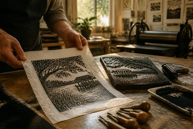
At a community print workshop in the South, a carved block rests beside a damp sheet of paper, ready to carry an image of a live-oak branch or a river landing. Woodcut or linocut is not only a choice of material: each surface shapes the marks an artist can make and the character of the finished print.
Both are relief-printing methods. The artist cuts away the areas meant to remain unprinted, rolls ink over the raised surface, then presses paper against it. In Southern art, that process can give local subjects—from marsh grasses to town porches—a distinct visual voice without dictating what the image must mean.
Wood grain can shape the image
Wood has a grain: the direction and pattern of its fibres. In a woodcut, grain may show through an inked area, interrupt a cut or influence the tool’s path. A cut moving with the fibres can leave a long, directional mark; a cut crossing them may meet more resistance and produce a less even edge.
The kind of wood and the way it is cut also matter. A plank cut along the grain behaves differently from end-grain wood, where the tool meets the ends of the fibres. The first can support expressive, directional lines; the second can allow finer detail, although it calls for careful cutting.
In a print of a cypress swamp or an oak-lined road, those natural lines can echo the subject without simply illustrating it. Look for streaks, flecks or slight breaks in a broad inked shape: they may reveal the wood beneath the image.
Linoleum gives the cutter a more even surface
Linoleum, usually called lino in printmaking, has a comparatively consistent surface and lacks wood’s directional grain. A cutter can move across it without negotiating fibres, so curves and small shapes may feel more predictable. The printed line records the blade’s path more directly, much as a pencil line on a smooth card is easier to follow than one drawn across a rough, ridged surface.
This can suit bold silhouettes, clean contours and repeated patterns. A curve in a magnolia leaf or the outline of a church window may hold a steady edge, while closely spaced cuts can make a deliberate rhythm. Lino does not make a design automatically neat: pressure, blade shape and movement still affect the result.
Southern printmakers may choose either material for familiar places and subjects. The distinction is not a regional rule; it is one way an artist can make a subject feel more textured, graphic or carefully controlled.
Cutting tools leave clues in edges and channels
Relief tools remove material in narrow channels or broader scoops. A V-shaped gouge tends to make a pointed furrow, while a U-shaped gouge removes a rounder strip. In wood, grain can steer or resist either cut; in lino, the blade often travels more evenly.
That difference can appear at corners and along narrow lines. A woodcut edge may carry small bites where fibres respond unevenly, while a linocut curve can look smooth and continuous. But these are tendencies, not fixed rules: a carefully carved woodcut can be crisp, and lino can be scratched, rough or densely worked.
Notice where a carved line tapers or stops. An abrupt point may reflect a short, decisive cut; a rounded end may come from turning a gouge through the block. These details tell you about the carved surface, not just the subject pictured.
Inked shapes show texture and printing choices
The raised, uncut areas carry ink, while the recessed cuts generally leave the paper showing through. A broad dark shape therefore offers a useful place to inspect the surface. Grain may break up a woodcut’s inked area; lino may print a more consistent field, though inking and paper contact can make either material appear uneven.
A small gap in a dark shape is not necessarily a carved mark. It might come from the roller laying ink unevenly or from the paper making lighter contact with the block. Compare several parts of the print: texture that runs in a consistent direction may point to grain, while scattered gaps may have another cause.
Say you are examining an invented print of a Southern river bend, and the bank is a broad, dark shape. You observe long streaks aligned in one direction, short cuts that follow the same path, and a rough edge where lines cross it; those clues make a woodcut a plausible reading. If instead the shape is even and its edges follow smooth, deliberate curves, lino becomes plausible, though the image alone cannot settle the question.
Repeated marks create different visual rhythms
Artists build tone by carving repeated lines rather than blending shades. Close marks can suggest shadow, water or foliage. In wood, the grain may reinforce a shared direction; in lino, the pattern can seem more clearly planned because less natural grain competes for attention.
Compare the spacing as well as the shape of the marks. If their gaps widen and narrow in a way that follows the wood, the block may be contributing an irregular rhythm. If spacing stays consistent, the artist may be arranging a more deliberate pattern. Either approach can appear in one print.
For a useful comparison, inspect three places: a broad dark area, a curved contour and a cluster of short parallel marks. Together they reveal more about surface, tool and rhythm than the general impression that a print looks rough or polished.
How can you tell woodcut from linocut?
Can one mark identify the material?
Usually not with confidence. A rough edge may come from wood, forceful lino carving or the printing process, so look for several clues across the image.
Does a woodcut always show grain?
No. Grain can be subtle, obscured by ink or hard to see in a small reproduction. Its absence does not rule out wood.
Is linocut always smoother than woodcut?
No. Lino often permits flowing, controlled cuts, but artists can carve it roughly or leave a scratched texture. The distinction concerns material tendencies, not an absolute visual rule.
What should you compare first?
Start with a broad inked area, a curved edge and a group of repeated lines. These reveal different aspects of texture and cutting, helping you weigh several clues together.
Read the surface in its artistic setting
A print’s appearance comes from the material and the artist’s decisions. The artist chooses where to cut, which tools to use and how to arrange the marks; wood or lino responds with grain, resistance or a comparatively even surface. In Southern visual culture, those choices may support a particular sense of place, but the material alone does not explain the image.
When you encounter a woodcut or linocut, begin with the edges and the texture of its inked shapes. Ask whether marks seem to follow natural grain or a more even surface, then check whether other parts of the print support that impression. That close looking helps you read not only the material, but also how an artist has made it serve the scene.