How Negative Space Shapes Southern Paintings
Negative space in painting helps you read Southern scenes, notice how forms relate and see how a quiet wall, sky or field shapes the composition.
At a gallery, you stop before a painting of a red bowl on a pale table, perhaps in a still life by a Southern artist. The bowl is easy to name, but your eye keeps returning to the broad stretch of wall around it. That quiet area is negative space in painting: a shaped part of the composition that can direct attention, set a pace and give objects room to relate.
In paintings connected to Southern places and cultural life, open space might be a sunlit porch wall, a stretch of river sky, or the gap between figures at a church gathering. These details do not carry one fixed regional meaning. Their visual work depends on colour, edges, scale and the forms around them.
Negative space means the areas around and between the main forms. It may be unpainted canvas, a thinly painted ground, or a quiet field of colour with little detail. The area is not empty of meaning: like the clear patch on a kitchen table that makes a cup easier to see, its shape and position affect how the other forms read.
Start with the subject and its surrounding space
If one object catches your eye immediately, notice what surrounds it. A pale halo around a dark bottle can make the bottle stand apart; a similar dark patch nearby may pull your attention away. Contrast and separation work together, so the space does not act alone.
Look for a path your eye might take. A hand turned towards an open patch of canvas can lead your gaze into it, while a row of objects may draw your attention across the picture. In a portrait set on a Southern porch, for instance, the open wall behind a seated figure might give the face visual prominence without making the setting disappear.
Use this approach when a painting has an apparent focal point but you are unsure why it feels emphatic. Ask what sits close to the focal form and what is kept apart. Compare their tones and edges to see whether the surrounding space creates a pause, a boundary or a visual link.
Read the gaps between figures and objects
In a painting with several figures, vessels or plants, the gaps between them can be as distinctive as the forms themselves. A narrow wedge between two shoulders may feel like a channel; a larger opening between a figure and a chair may make them seem separate. In a scene of a family gathering or a market, those gaps can help you follow relationships without treating the people as a simple inventory.
Follow one gap with your eyes without naming the objects around it. Does it widen, taper, bend or close? This is a practical way to notice composition, the arrangement of forms and spaces across the whole picture.
When a busy scene seems difficult to take in, compare its openings. Repeating gaps may make the arrangement feel ordered; sharply varied ones may contribute to a more unsettled or lively effect. Treat those impressions as readings to check against the picture, not as fixed meanings attached to a particular shape.
Notice how edges make open areas active
An open patch can seem quiet, but its boundary with a painted form may carry considerable energy. A crisp edge makes separation easy to read. A softened or broken edge can let a form dissolve into its surroundings, so the space feels less like a backdrop and more like part of the same atmosphere.
In a portrait, a dark sleeve against a light wall may be sharply defined on one side and lost into shadow on the other. The firm edge gives the arm a clear limit; the softer one lets it merge visually with nearby darks. In paintings of porches, fields or waterways, similarly varied edges can distinguish a solid structure from a hazy distance.
When a painting seems to shift between solid and hazy, ask which edges contain a form and which let it flow outward. Compare them with quieter passages. The contrast between a firm contour and a less certain one can make both easier to see.
Choose a way to read the painting in front of you
Pick the approach that fits the difficulty you are having as a viewer. For each observation, let the result guide your next look:
- If one form dominates: Check the space immediately around it. If nearby contrast separates it from its setting, follow that boundary; if the contrast is weak, compare the form’s colour and edges with other focal areas instead.
- If several forms seem jumbled: Check the gaps between them. If the openings make clear channels, trace those to understand connections; if they overlap or disappear, examine the shared edges and tones instead.
- If the picture feels calm or tense: Compare the sizes and shapes of its open areas. If broad, even passages support a sense of pause, look for what interrupts them; if the gaps are compressed or angled, check which forms create that pressure before assigning a mood.
- If forms seem to fade or merge: Check where their edges become soft or disappear. If the boundary is uncertain, follow the change in tone to distinguish the form; if it stays clear, look at the surrounding colour and texture instead.
- If a quiet patch seems to contribute little: Compare its colour, value and texture with nearby marks. If it differs noticeably, consider how that contrast redirects attention; if it resembles its surroundings, trace its outline to see whether its shape still balances the composition.
- If a setting feels detached from its subject: Check whether a wall, sky, field or porch area shares colours or lines with the focal form. If it does, follow those links; if it does not, examine whether its contrast creates deliberate separation instead.
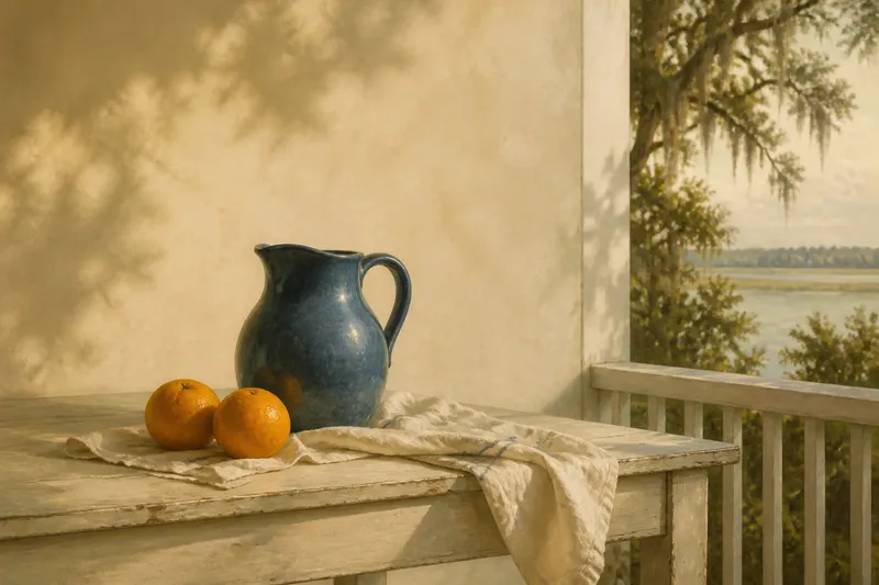
Say you are looking at an invented still life set on a Southern porch, with a blue jug, two oranges and a pale cloth; these details are imagined for the example. First, the jug draws your eye. Next, you trace the narrow opening between its handle and body and notice that its curve resembles a fold in the cloth. Then you compare the broad pale wall behind the jug with that small opening: the opening links the jug to the cloth, while the larger area gives the jug room to stand apart. The resulting reading is that the two quiet spaces perform different jobs, one connecting forms and the other separating them.
What should you ask when a painting feels crowded?
Is there open space between the main forms?
Look for small gaps as well as broad ones, including openings inside handles, between limbs or beneath a table. If their shapes remain visible, use them to separate overlapping forms; if they close up, compare the forms’ edges and tones instead.
Does the background compete with the subject?
Compare the background’s contrast, colour and detail with those of the subject. If it is richly marked, notice where it draws your eye; if it is quieter, check how that difference makes the subject more prominent, without assuming either choice is better.
Do the edges make the forms easy to distinguish?
Check whether outlines stay clear or disappear into nearby areas. If adjacent shapes share similar tones and soft edges, follow their changes in colour or texture to tell them apart; if their boundaries are already distinct, look at the spaces between them for another source of visual density.
Would removing a form change the space around it?
Imagine, only as a viewing exercise, that one object were absent. If the resulting gap would alter the composition’s balance or direction, the object shapes negative space as well as occupying it; if the gap would have little effect, examine the remaining forms for the stronger compositional relationship.
Separate visible details from the mood you infer
It is easy to say that a large open area feels lonely, generous or still. Such descriptions are interpretations rather than properties every viewer must share. Begin with what you can point to: the area is broad, pale, uninterrupted or edged by dark forms. Then notice the mood it suggests to you.
This distinction helps with representational painting, where an empty wall or stretch of sky may also establish a setting. Ask whether the area balances the picture, gives the eye a place to rest, or clarifies where an object sits. In a painting of a Southern landscape, for instance, a broad field of sky might establish distance while also framing a tree or building.
A space can feel open and constrained at once. A large pale ground may seem expansive until a dark branch, frame or figure cuts across it. Describe both the openness and the interruption; their tension may say more about the composition than either feature by itself.
Use negative space in painting to keep looking
When you return to a painting, choose one question rather than trying to explain the whole composition at once. Start with the focal form, the gaps between objects, or the edges that make a shape appear firm or uncertain. Then check whether the surrounding areas support or complicate your first impression.
Negative space in painting helps reveal relationships that object names can hide, including in works shaped by Southern places, gatherings and domestic settings. A wall, sky or unpainted ground may frame a subject, connect separate forms or interrupt an easy reading. When one corner seems quiet, compare its outline and edges with the busier parts; that small act of attention can show what the space contributes without requiring it to depict anything at all.